Eliza’s Better Half
Brand Identity, Packaging Design
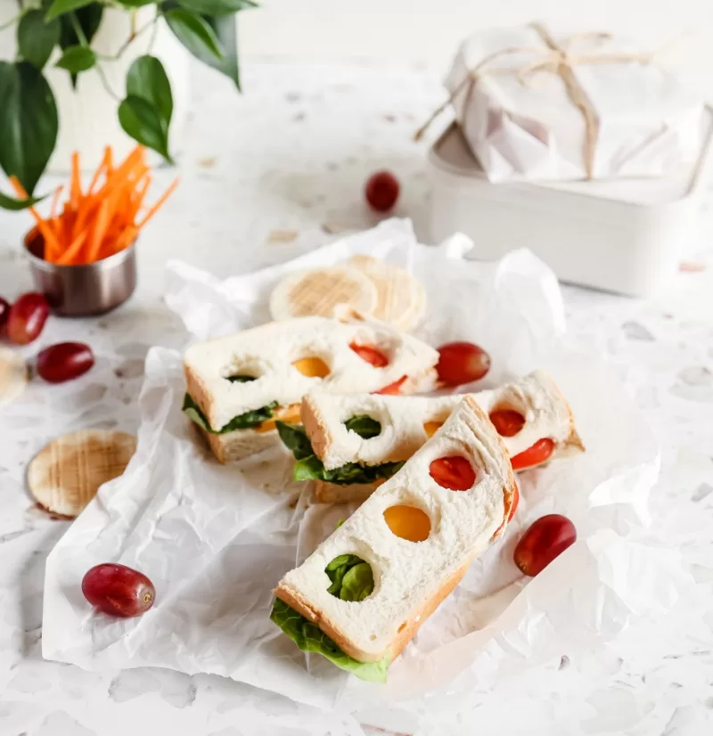
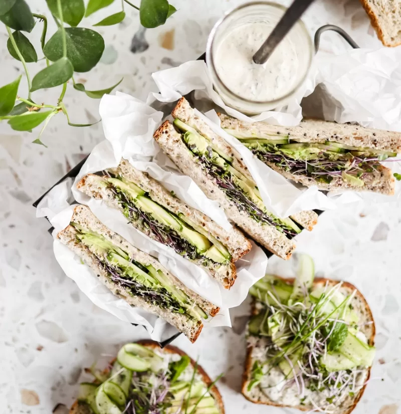
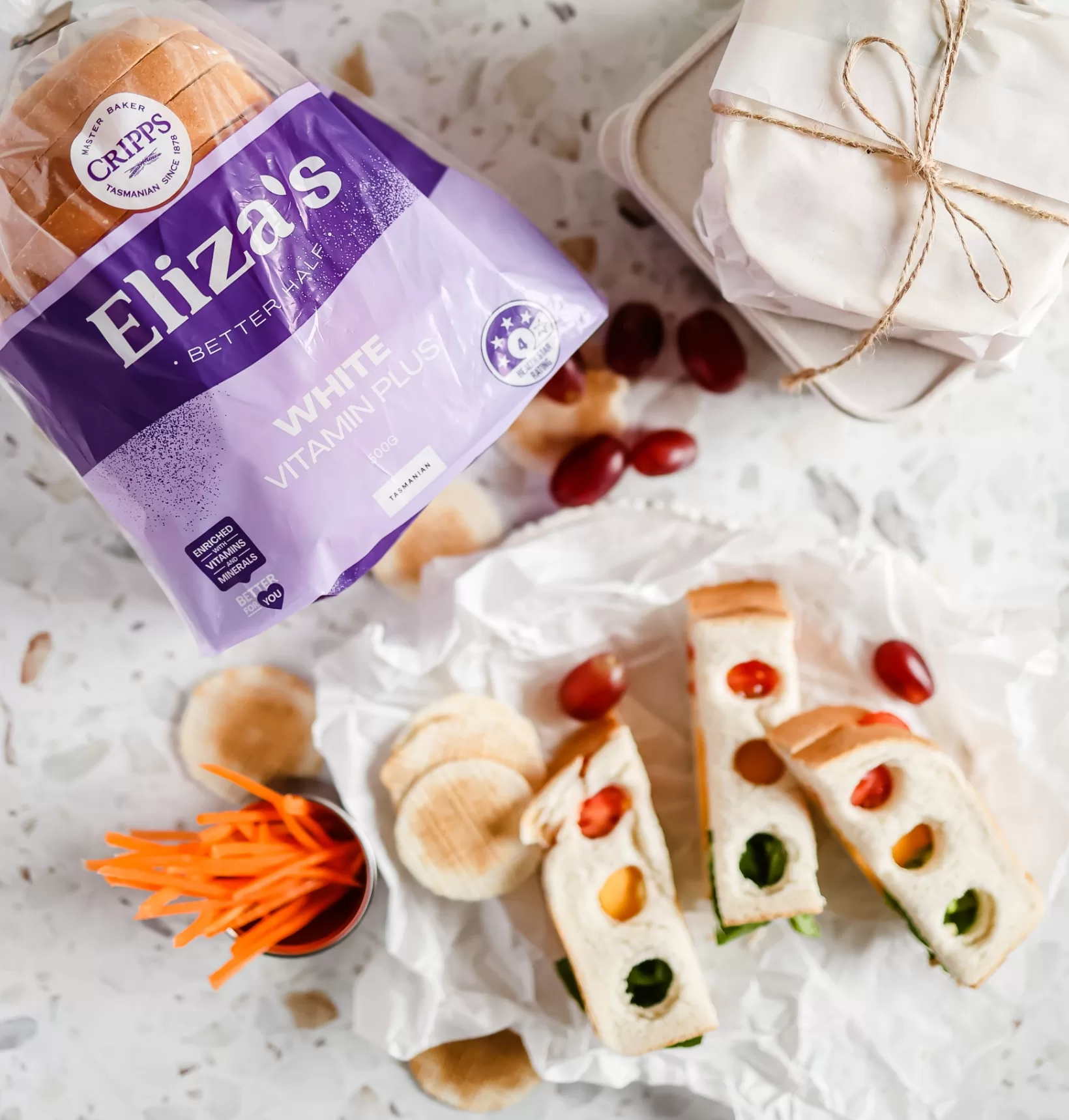
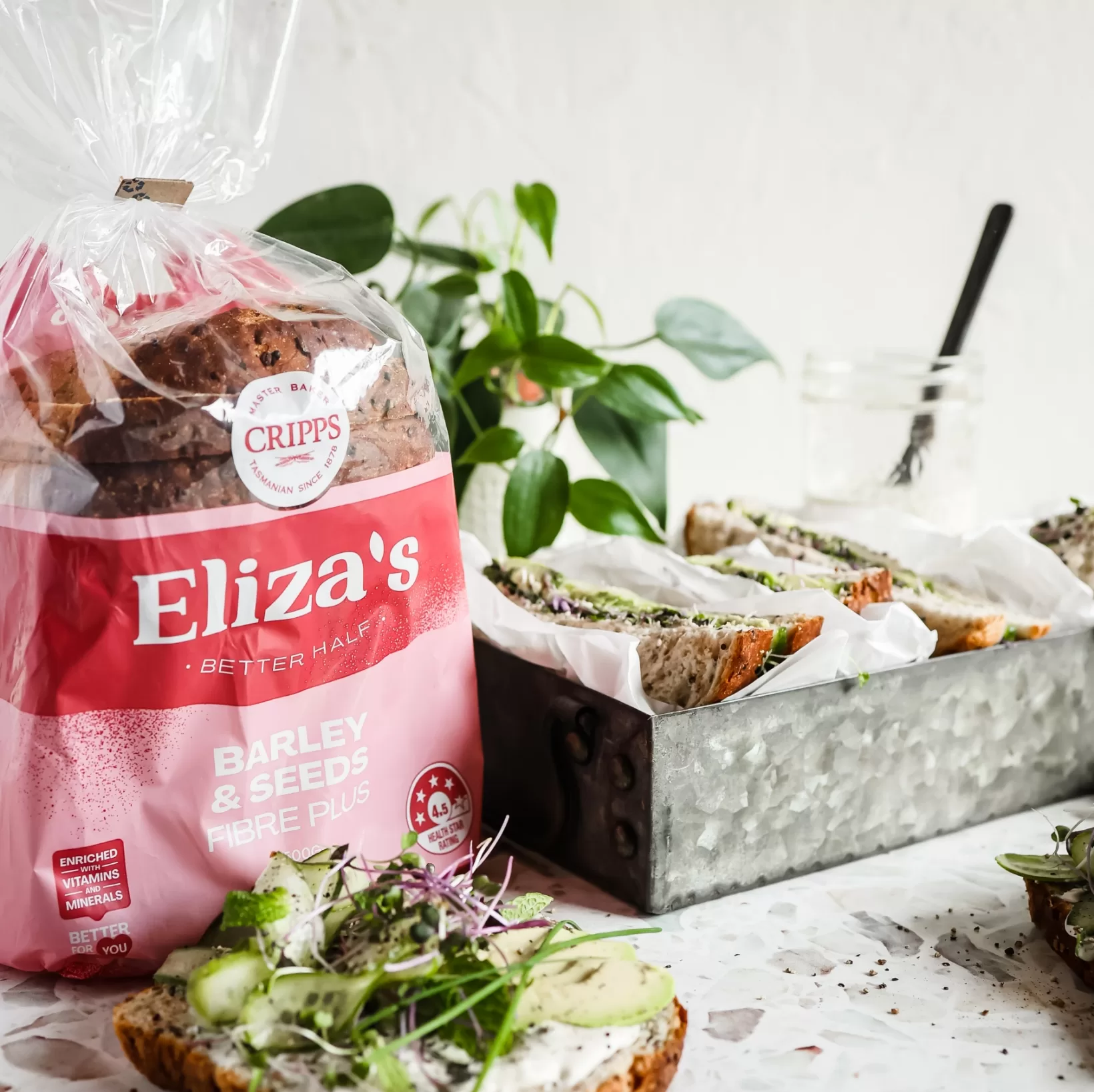
Flying Colours Group Tas, a renowned creative agency, recently accomplished the task of rebranding and designing the packaging for Eliza’s Better Half, yielding spectacular results. The new branding pays homage to the remarkable legacy of Eliza Cripps, tastefully representing her history and tradition while simultaneously conveying the message that quality deserves celebration.
The refreshed branding captures the essence of Eliza’s Better Half, emanating a sense of radiance and joy. Skillfully incorporating vibrant and bold colours, the brand exudes an energetic and captivating aesthetic, catching the eye and evoking a feeling of positivity and excitement, which resonates with consumers on a profound level.
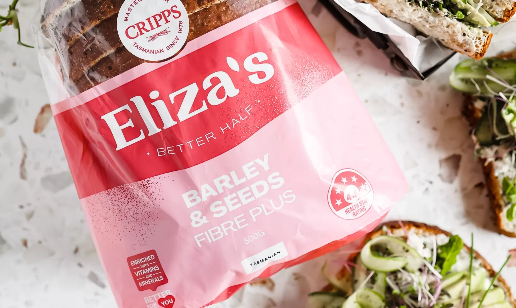
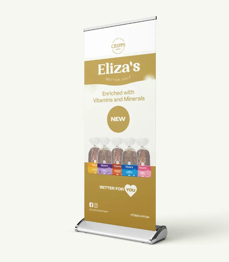
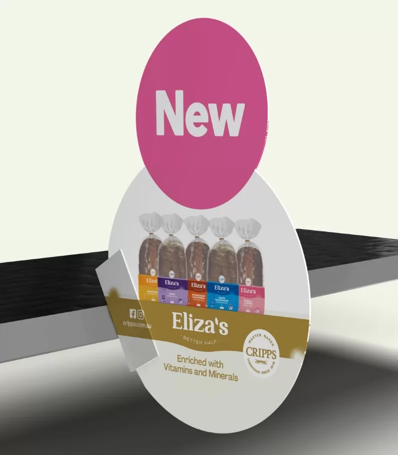
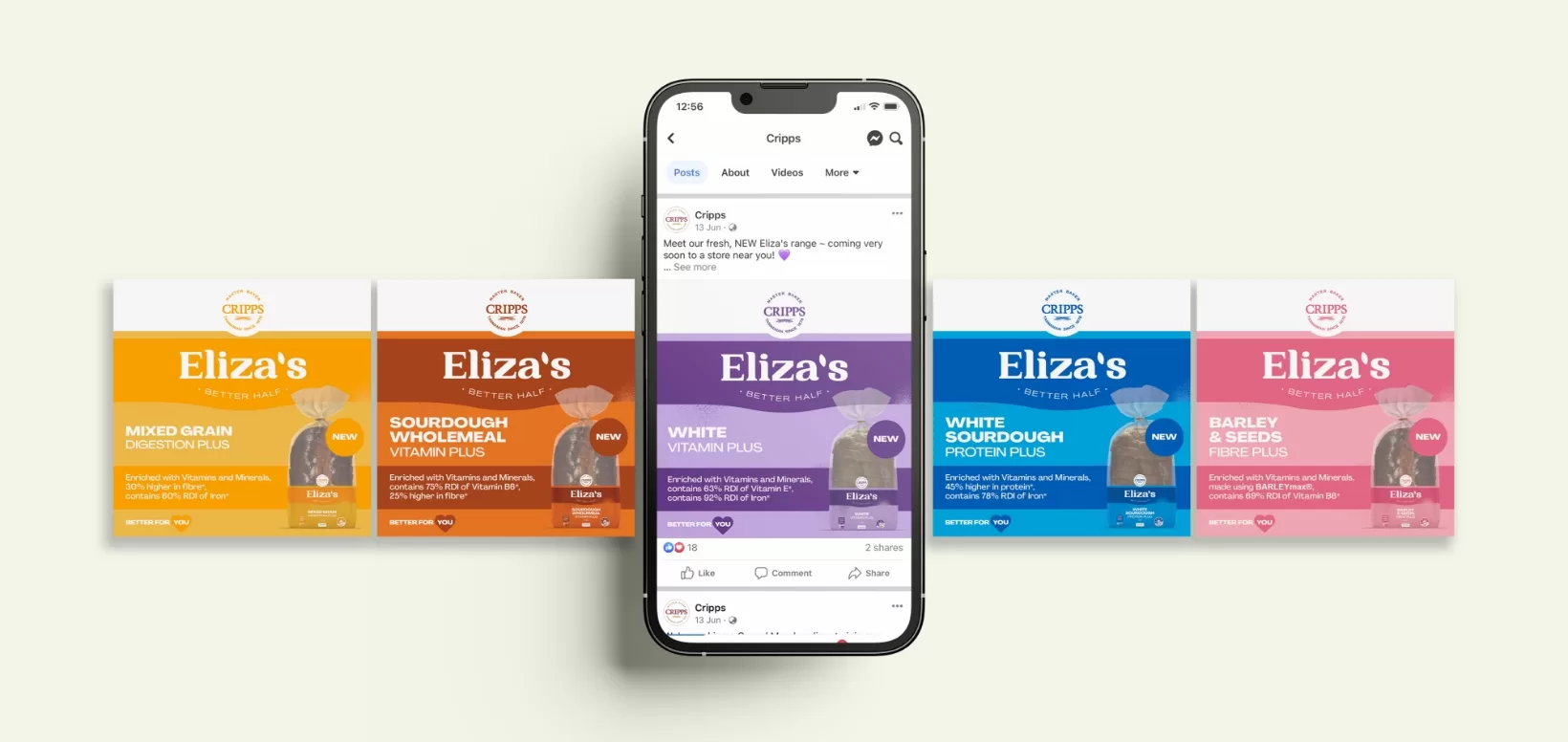
In this project, Flying Colours Group Tas demonstrates their expertise in branding, skillfully blending tradition with contemporary design elements to craft a visual identity that not only respects the past but also piques curiosity and entices potential customers. The packaging design serves as an ambassador for the brand, effectively communicating the exceptional quality of Eliza’s Better Half.
Overall, Flying Colours Group Tas successfully creates a relevant and engaging brand experience for Eliza’s Better Half. Their expertly executed branding and packaging design encapsulate the rich heritage of Eliza Cripps while conveying the message that quality should be celebrated. The updated branding’s vibrant and joyful feel ensures that Eliza’s Better Half will captivate consumers and leave a lasting impression, securing its place as a standout brand in the market.
At Flying Colours Group Tas, our goal is not only to exceed your expectations but also to sprinkle them with confetti and knock them out of the park. So, if you need a shake-up for your current look or some simple (or not-so-simple) signage or printing, then hey! Let’s chat.
Find out more about what we do, or follow us on Facebook or LinkedIn for weekly updates.


