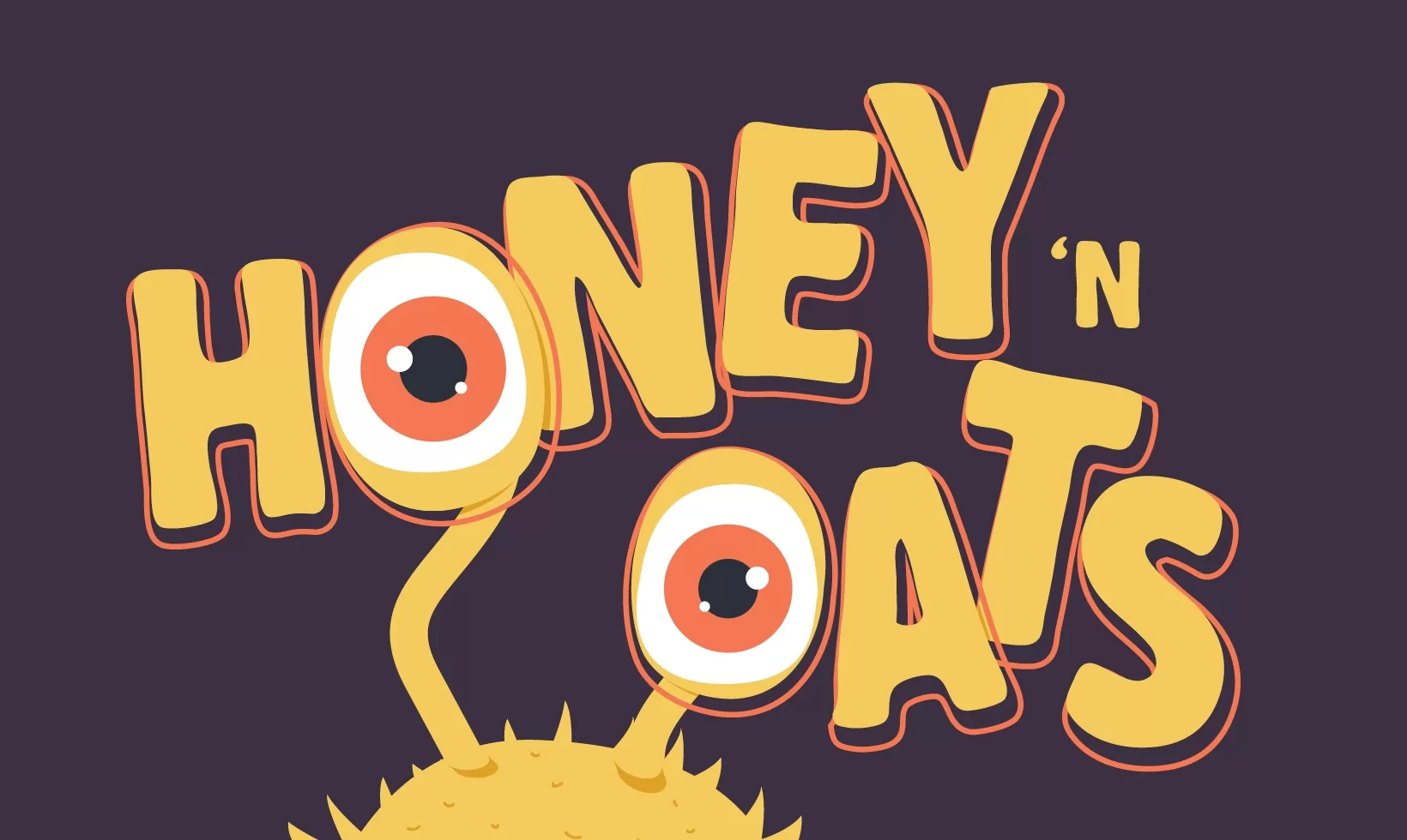
Honey ‘N Oats
Brand Identity, Packaging Design
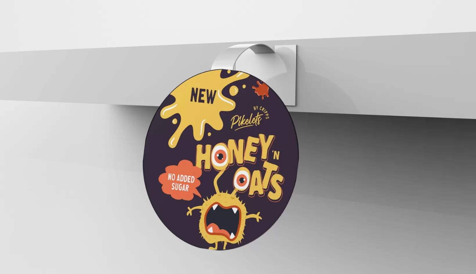
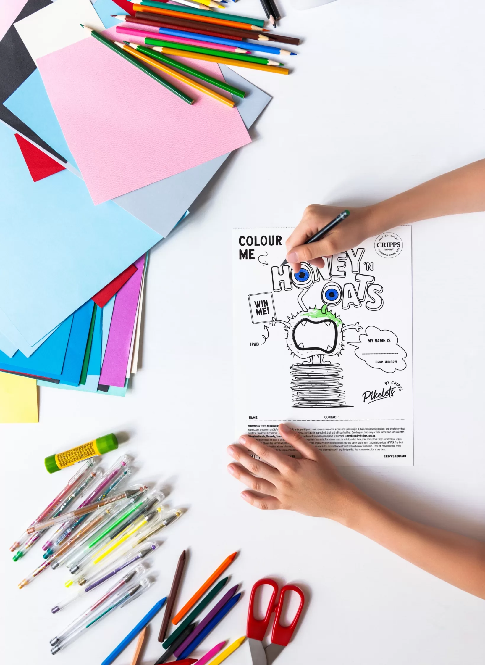
Introducing the captivating world of Honey n Oats brand design. A mischievous pikelet monster-inspired character takes center stage, infusing a playful attitude into healthy snacks. No more boring options; this delightful character brings a fresh perspective.
The pikelet monster, with its whimsical charm and mischievous grin, captures attention instantly. It embodies the brand’s philosophy: healthier choices can be exciting and enjoyable. Personifying the brand breaks free from health food stereotypes, creating fun and adventure.
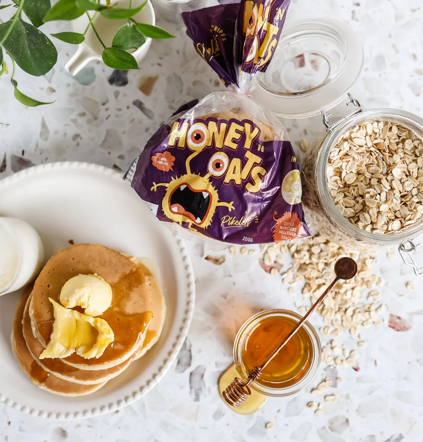
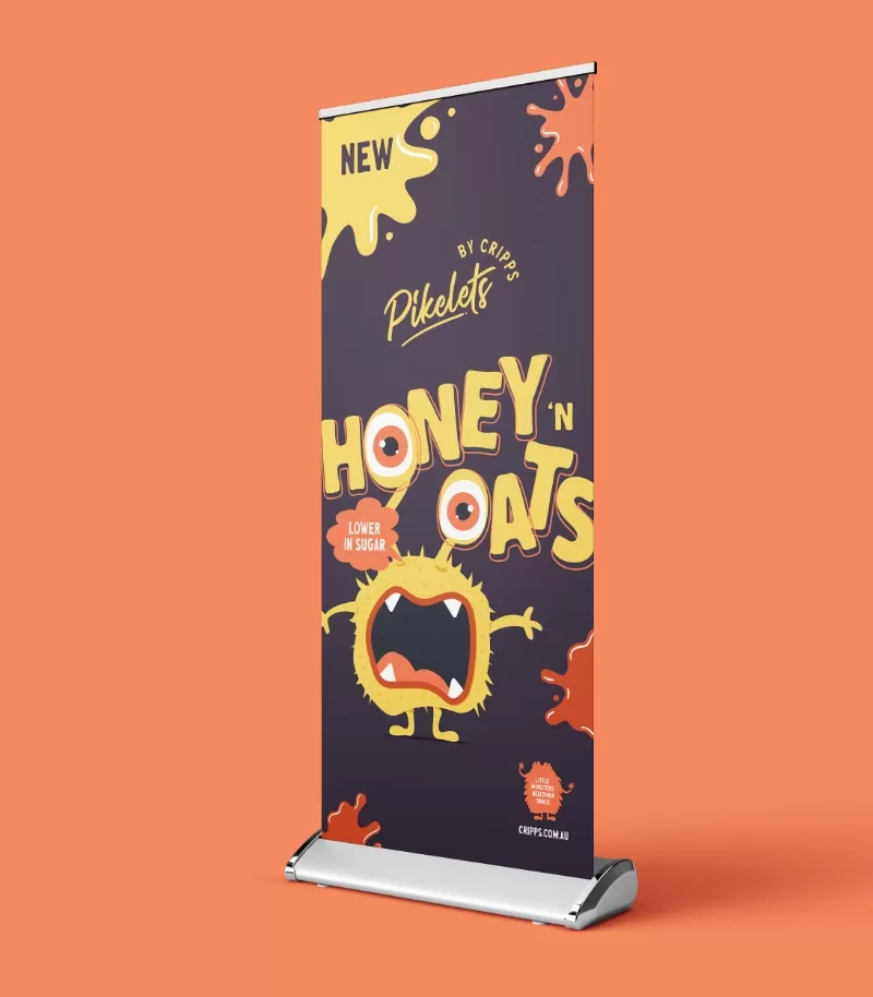
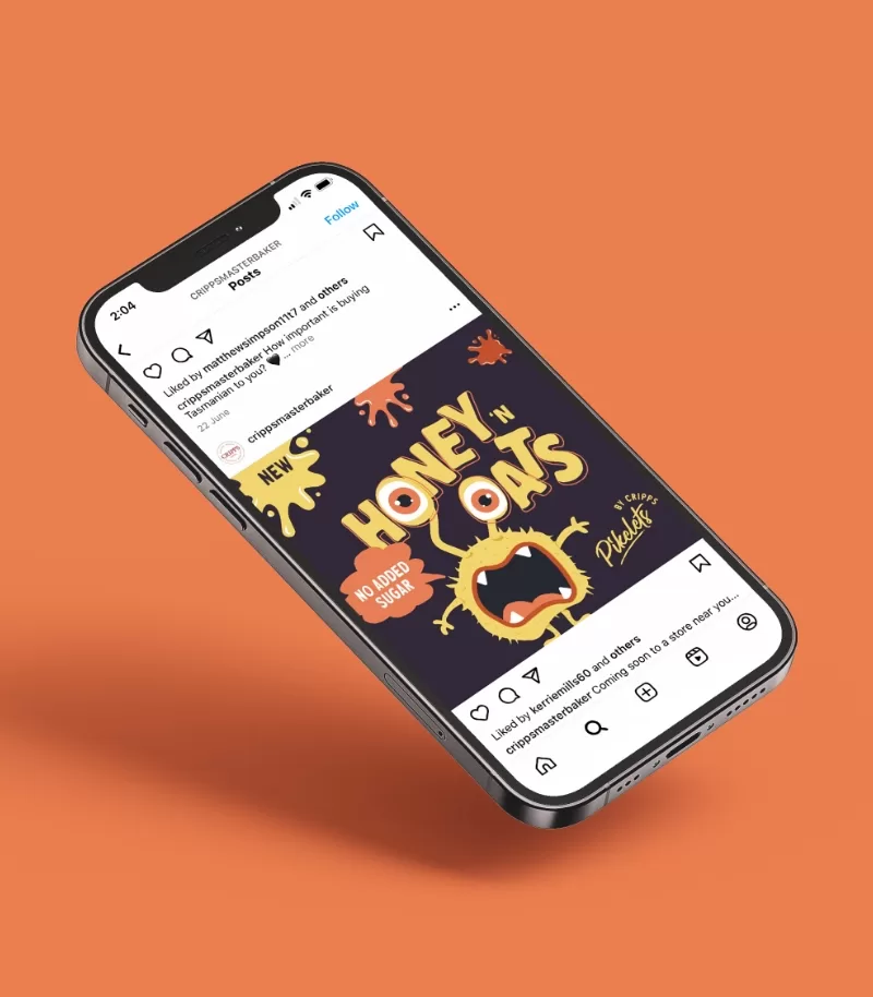
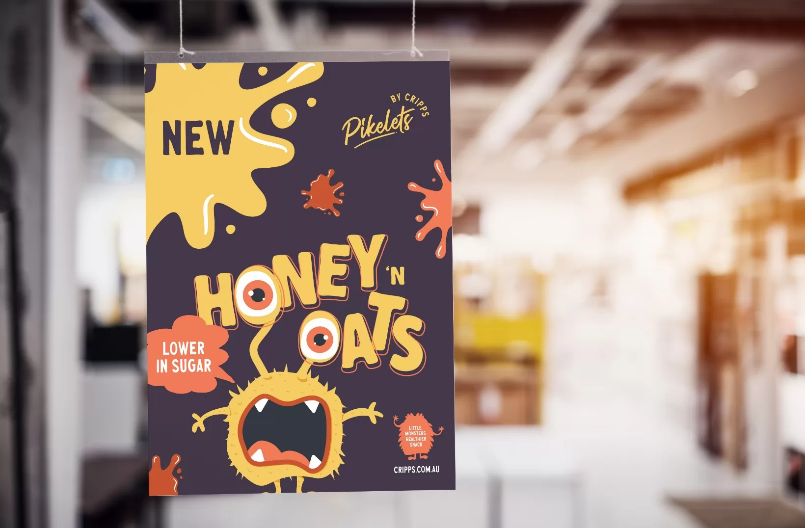
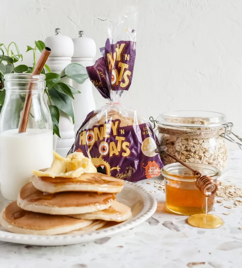
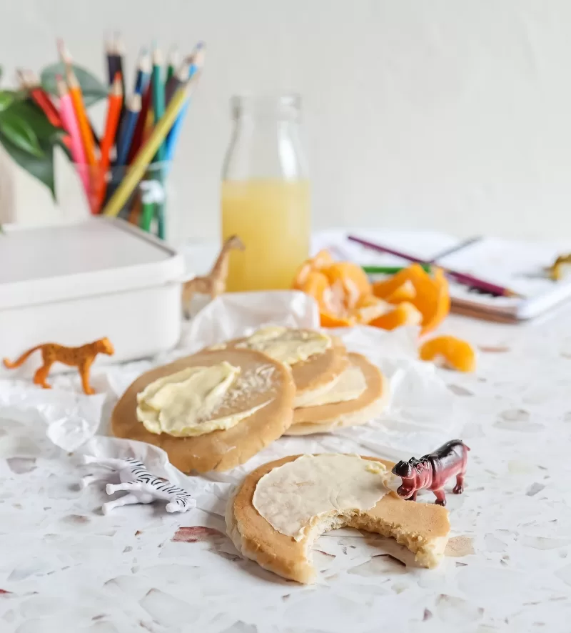
The pikelet monster’s design reminds us that even the healthiest options can be satisfying. Vibrant colors and animated features invite consumers on a delightful journey of nourishment and snacking joy. The character’s whimsy and charm alleviate intimidation, inviting exploration and indulgence.
Combining health and playfulness, Honey n Oats challenges the notion of dull nutritious snacks. The brand design sparks curiosity, encouraging a positive and exciting approach to dietary habits. Let the pikelet monster guide you to a world of wholesome enjoyment, where health and fun coexist in every delightful bite.
It’s our goal at Flying Colours Group Tas to not only exceed your expectations but sprinkle them with confetti and knock them out of the park. So, if your current look needs a shake-up or you’re in need of some simple (or not-so-simple) signage or printing, then hey! Let’s chat.
Find out more about what we do, or follow us on Facebook or LinkedIn for weekly updates.

