The Tea Equation
Packaging Design
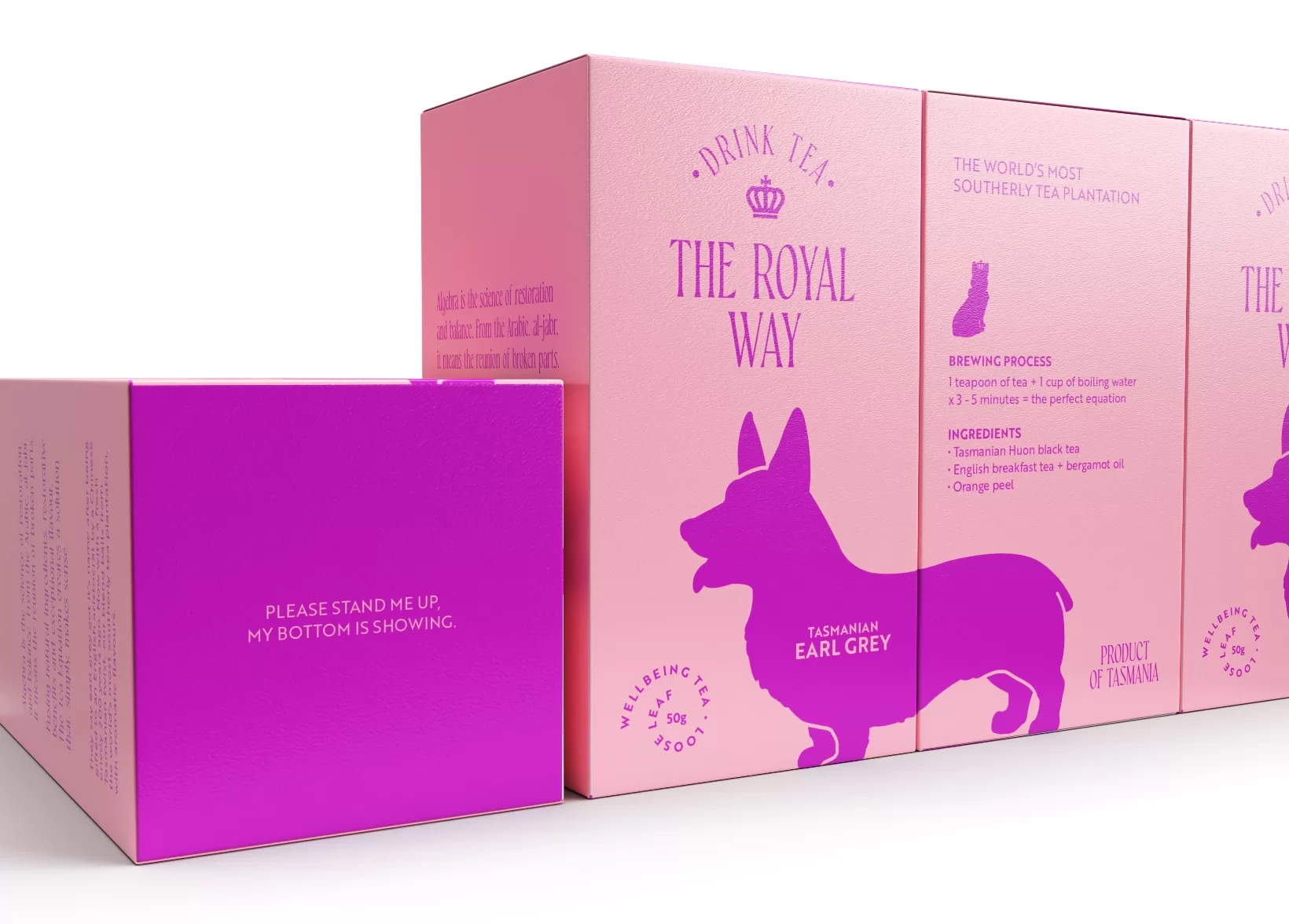
Flying Colours Group was entrusted with creating a stunning packaging design for The Tea Equation, drawing inspiration from the late Queen’s regal essence. They skillfully crafted a design exuding elegance and sophistication.
The chosen color palette plays a pivotal role in capturing the late Queen’s personality through a harmonious combination of rich and vibrant hues. This visually striking system seamlessly reflects her distinguished character. Despite a minimalist approach, the design is far from ordinary, as typography and illustrations ingeniously intertwine to create a memorable composition. Carefully selected typefaces enhance the aesthetic, complementing the intricate illustrations, leaving a lasting impression on consumers.
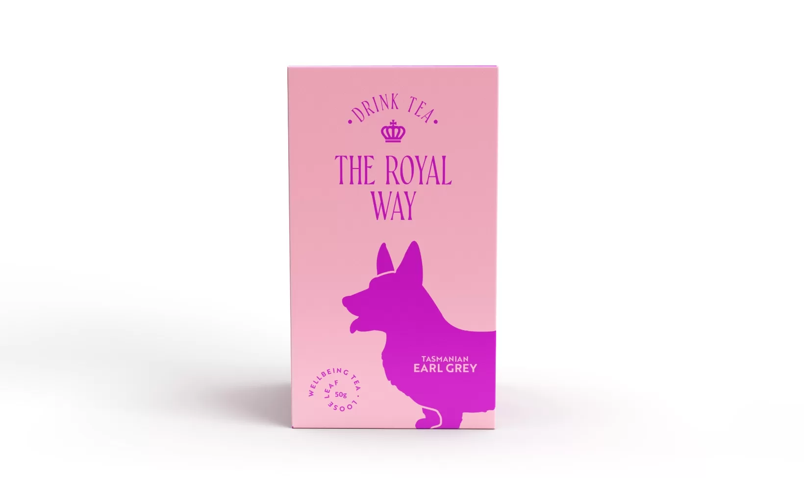
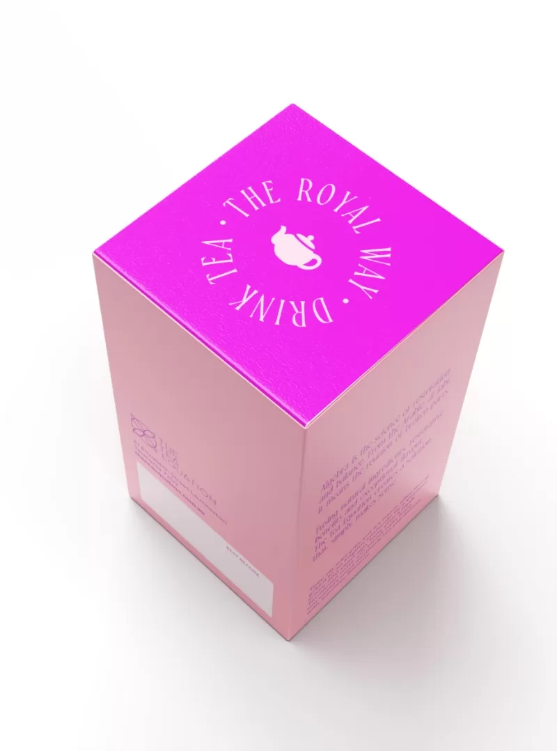
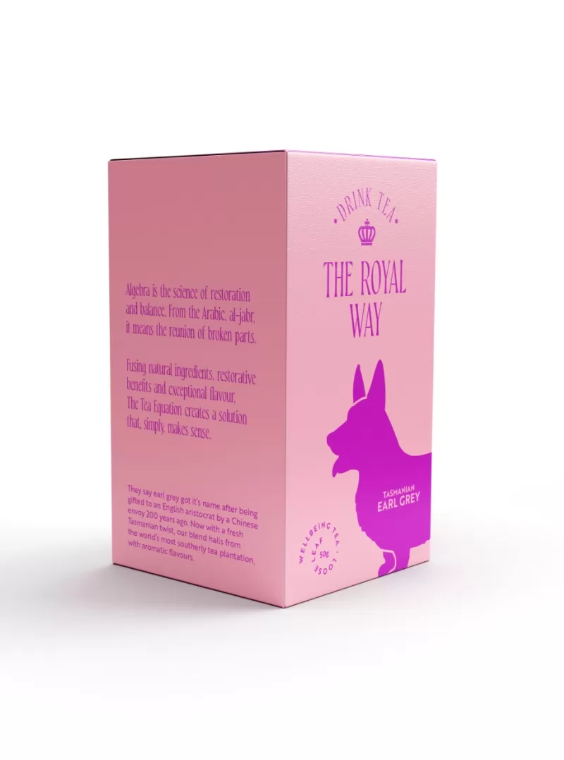
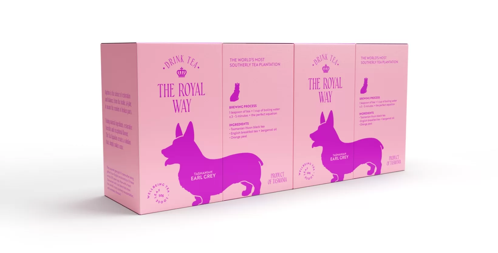
Flying Colours Group’s attention to detail and meticulous craftsmanship shine through in every aspect of the packaging design. From the choice of colors to the seamless integration of typography and illustration, every element works in unison to create a truly captivating visual experience.
Furthermore, their expertise in design and keen understanding of the late Queen’s personality enabled them to produce a packaging design for The Tea Equation that beautifully captures her essence. The final result is a design that not only visually pleases but also evokes a sense of regality and timelessness.
It’s our goal at Flying Colours Group to not only exceed your expectations but sprinkle them with confetti and knock them out of the park. So, if your current look needs a shake-up or you’re in need of some simple (or not-so-simple) signage or printing, then hey! Let’s chat.
Find out more about what we do, or follow us on Facebook or LinkedIn for weekly updates.

